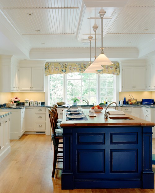
We are really excited to bring Pantone’s Fall color trends into our home décor, how about you? The shades for Autumn and Winter are anything but dull, and offer a lot of room to set the mood for the season without losing bold colors. Radiant Orchid and Mauve Mist bring different points on the purple spectrum into play, alongside rich Sangria. Royal Blue and Bright Cobalt bring elegance and zing to the blue end of things, while Aurora Red, Misted Yellow and Cypress are muted warm tones. The season’s neutrals are Cognac and Aluminum. Here’s our simple guide to combining the hottest colors of the season to add new life to your home decor.
Misted Yellow
Misted Yellow is the season’s surprise star. Its dusky tone is reminiscent of fall leaves, and it pairs with a remarkable range of colors. Cypress capitalizes on Misted Yellow’s natural feel – imagine them worked into a rustic, sun-filled living room with some well-chosen accent plants.
Sangria takes Misted Yellow into a deeper, more exotic range. Use it to pull some summer heat into the fall, with lush floral patterns.
Mauve Mist, on the other hand, moves Misted Yellow into a cooler spectrum. Yellow and purple are opposites on the color wheel, so this pairing makes for strong contrast. But the muted quality of the shades tones down the boldness, so it’s easier than you might think. Use this to add a new twist to a bedroom, where you want a creative punch without sacrificing the comfortable vibe.
Aluminum, the season’s sleek neutral, sets off Misted Yellow’s warmth. Think about this unusual pairing for an inviting office space. Add Cognac to the mix as a rich accent color.
Team up Misted Yellow with Aurora Red and Bright Cobalt for a fresh twist on the classic primary-color trio. Together, they make a space cheerful. This can work for a kid’s room, but the grouping isn’t exactly childish – more like happy. The trio is also nicely suited to a kitchen or other active space, especially if the style of the house is inspired by Mediterranean or Southwestern styles.
To go a bit more sedate without losing vibrancy, keep the Misted Yellow and use the deeper-toned Royal Blue.
Cypress
Cypress really makes you feel like you’re in a forest on a sunny fall day. It’s a perfect fit with Cognac. They’re both deeper shades, so make sure to use them in a room that gets plenty of light so their richness can emerge without overwhelming.
Cypress and Aurora Red are another pair of color-wheel opposites. They’re energetic and fun. To avoid an overly Christmas-y feel, use one as a dominant color and the other to add pop.
Royal Blue
Create a cool-hued bedroom or meditation space with Royal Blue and Aluminum. This grouping is great for setting a calm, relaxed mood without creating a truly chilly feel. To punch up the energy a bit, try Bright Cobalt for the blue tone instead. Bright Cobalt also works great with Aluminum on its own.
Or, try Cognac to add elegance to the Bright Cobalt and Aluminum. Alongside bedrooms, these are perfect picks for a living room or parlor – work with dark woods or brushed metals to accentuate the palette.
Happy decorating!


