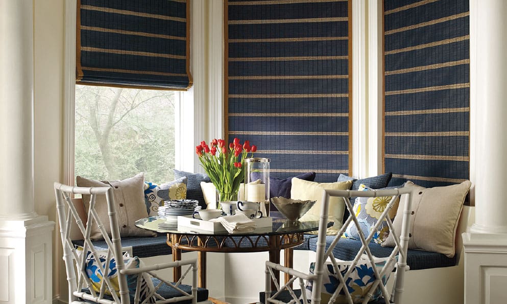
Every year, the design community waits with bated breath for the authorities on color (i.e. Pantone, Sherwin-Williams, etc.) to select their color of the year. The selection process is actually quite involved. The chosen color doesn’t just reflect what’s hot in interior design and fashion. It’s also supposed to epitomize the pulse of society; where we are now and where we’re headed. That’s pretty heady stuff for what many feel is essentially a paint swatch.
Nevertheless, we can’t help but get swept up in the buzz and are excited to share what’s in store for all things color in 2020. And for a bit more fun, we’ve decided to show you just how gorgeous these colors would look on your windows. First up…
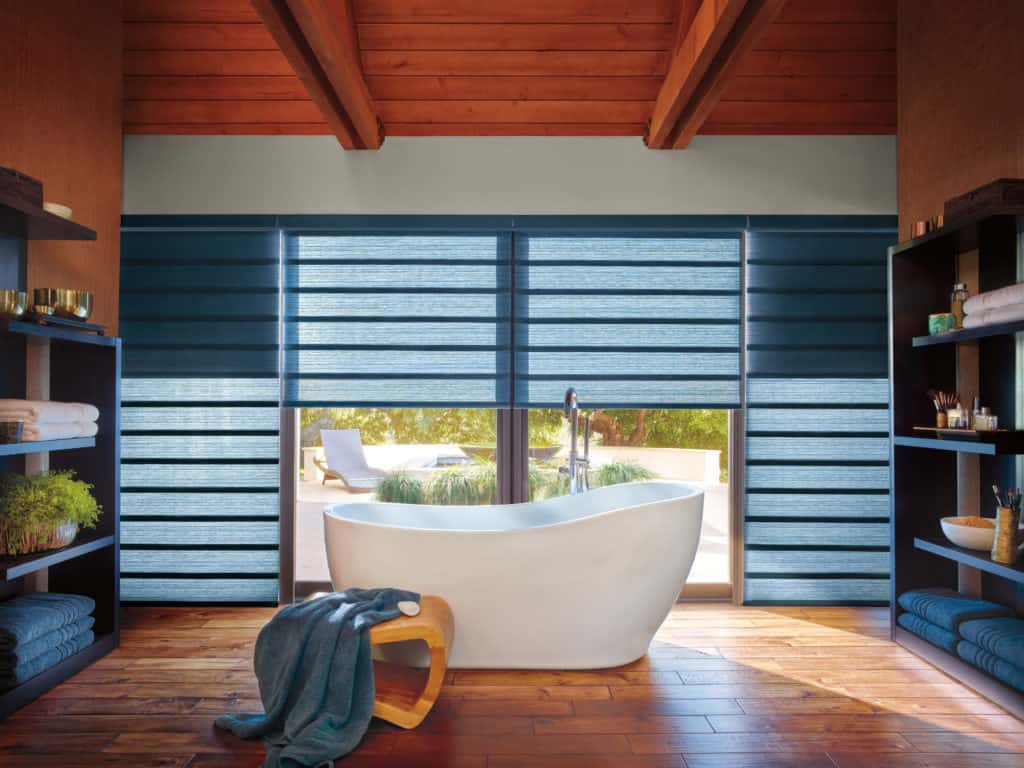
2020 Pantone Color of the Year: Classic Blue
We don’t always love Pantone’s choices (remember Marsala – yuck!), but we are definitely digging this vibrant shade of blue. This color packs a major design punch – just look at how Vignette® Modern Roman Shades in classic blue up the wow factor of this bathroom. Next up we have…
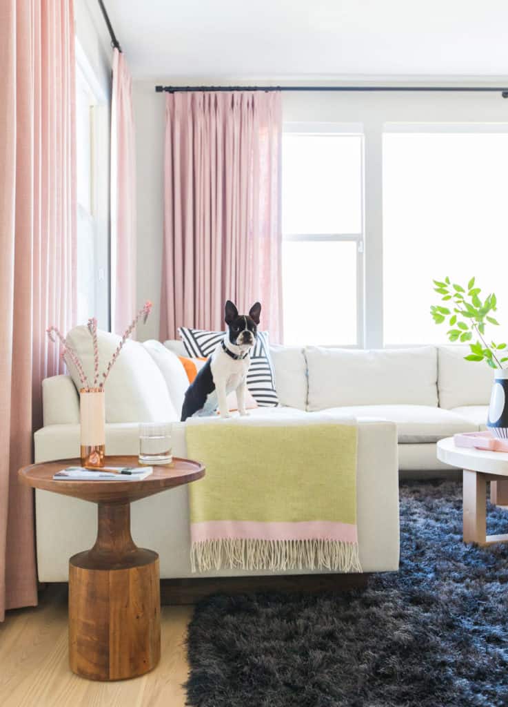
Benjamin Moore’s 2020 Color of the Year: First Light
If there ever was a color that defined a decade it would be Millennial pink. Which is why we thought it was so interesting that Benjamin Moore would choose a light pink to kick-off the next decade. Regardless, we love a good pastel moment, like the gorgeous custom pink drapery and fabric Roman shades in Jaime Derringer’s (Design Milk) living and dining rooms. Full details on this fun makeover can be found here. And this next shade may look a bit familiar…
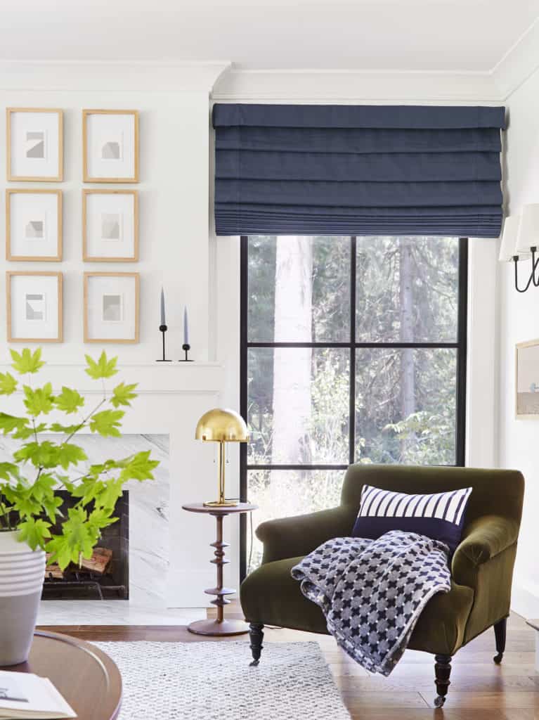
Sherwin-William’s 2020 Color of the Year: Naval
Yup you guessed it, another saturated shade of blue. But unlike Pantone’s choice, Naval is Classic Blue’s darker and moodier brother. Like a beloved pair of jeans, this shade of blue practically goes with everything. Case in point – the custom navy-blue Roman shades featured in this living room designed by stylist extraordinaire – Emily Henderson. More photos from this killer design project can be found here. And finally, we have…
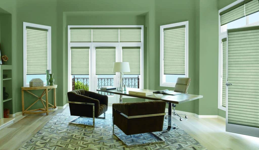
Behr’s 2020 Color of the Year: Back to Nature
When you’re craving something neutral, but are tired of beige or gray, this calming shade of green is the perfect alternative. The soft green Hunter Douglas Sonnette™ Cellular Roller Shades in this dining room do a great job of making this minimalist space just tad more interesting. Because neutral doesn’t have to mean boring.
Scared of Color?
You’re not alone, which is why so many folks end up with white or neutral blinds. But did you know that Hunter Douglas has one of the most extensive collections of fabric colors on the market? So, if this blog post happened to pique your interest in color, then sign-up for a free in-home design consultation. Our design consultants will help you navigate the whole color spectrum, ensuring you choose the perfect shade for your windows and décor.


