At the end of every year, the authorities on all things color – Pantone, paint companies and home décor experts choose the color trends for the upcoming year. As design professionals specializing in window treatments, we can’t wait to see what colors will be trending and especially enjoy the commentary from the design community. Because let’s be real, the annual choices usually come with a heavy dose of drama. Just ask Pantone when they chose the color Marsala in 2015. At the time, this desert tone surprised everyone, but fast-forward to today and desert tones like Marsala are a very popular color trend. Excited to see what’s in store for 2021? Let’s explore what’s hot and what’s not in all things color.
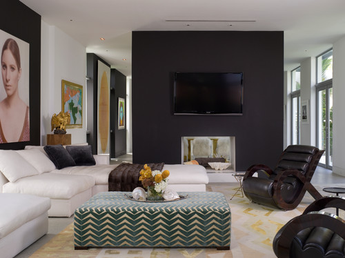
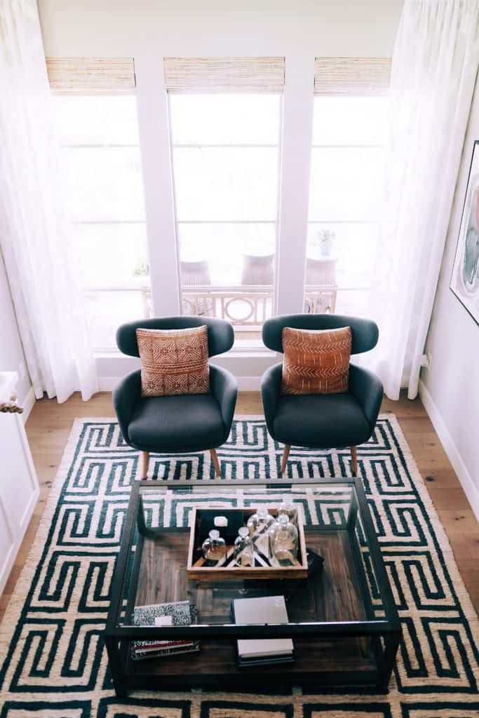
Photo by BROWN DAVIS ARCHITECTURE & INTERIORS
2021 Colors Of The Year Are Met With Mixed Reviews
Let’s start off with Pantone. For 2021, Pantone decided to choose two colors rather than one: Illuminating (a bright yellow) and Ultimate Gray. The consensus from the design community – they basically hated both colors. Everyone is tiring of gray and yellow is very rarely a color people embrace.
Benjamin Moore and Sherwin-Williams color choices were definitely more on point. Benjamin Moore chose Aegean Teal, a soft blue/green hue that’s been popular for colored cabinets. Sherwin-Williams selected Urbane Bronze as their 2021 Color of the Year. This moody black-brown tone is a warm alternative to the charcoal gray we’ve been seeing the past few years.
Photo by Josh Hemsley on Unsplash
Desert Tones Warm Up Spaces
Desert-inspired home décor has been a popular design style for the past few years, particularly among millennials who gravitate towards boho styles. The warm palette that supports this design style, anchored by the color terracotta, features a wide range of hues from soft dusty pinks to burnt oranges and deep mauves.
Not sold on an entire room in these sunset shades? Try infusing some warmth into a neutral color space by adding pops of this desert palette around a room, or go bold by painting an accent wall.
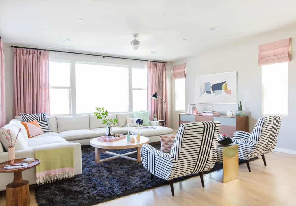
Design Milk Makeover
Punchy Pastels Add The Wow Factor
A great way to describe the colors in this palette is restrained exuberance. Colors range from punchy pinks to deep peacock greens, with a touch of black and white to modernize the scheme. This palette is inspired by 80s home décor, a popular trend in interior design that is being reimagined for 2021.
Colorful drapery, handmade pottery and accent chairs with round silhouettes are a great way to celebrate this fun color palette.
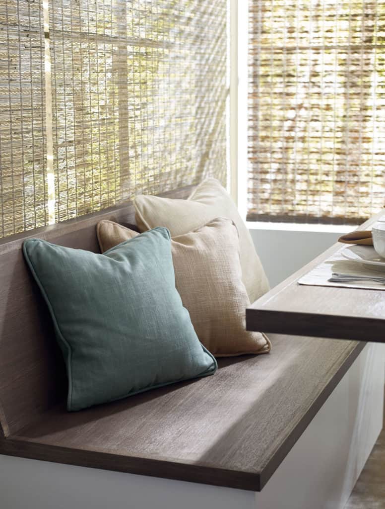
Pictured: Kirsch Woven Wood Shades
Soft Neutral Tones Create A Calming Home Environment
Finally, and probably the most unusual color trend for 2021 is actually the complete lack of color itself. Neutral interiors are all the rage for their ability to instantly inspire a sense of calm and peace for inhabitants. Wall colors, window treatments, rugs, wood tones, furnishings, etc. are as if the saturation dial has been turned completely down. Colors range from warm to cool, with white, cream, gray, tan, blush and wood tones dominating the palette.
Popular design styles using this color palette are Japandi, California Cool and Modern Farmhouse. Each of these aesthetics celebrate texture and materials in their natural neutral form.
Schedule Your Free Design Consultation
Do you have any fun decorating projects on your to-do list for 2021? Then consider scheduling a free design consultation with one of our design experts. Each of our designers has an eye for color and would love to help you choose window treatments that will complement your home’s color palette. We offer virtual and in-home appointments and will even measure and install your windows. Sign-up today!


