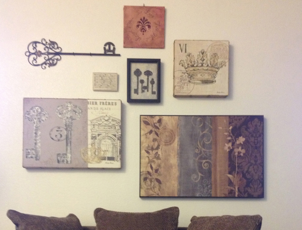
When it comes time to decorate your walls, there are a whole slew of options to consider. Adding photos, artwork, and other memorabilia can be the personal touch that turns a house into a home. It can seem overwhelming at first, but with a few helpful hints, you can take the fear out of decorating and create a beautiful wall display.
Let your display tell a story
Begin by selecting the items that you want to be prominent on your wall. They could be a mixture of personal photographs, vacation souvenirs, or other mementos. By displaying items in groups that have a common theme or interest, your display can be more than something to look at – it can tell a story.
Photos of your favorite vacation beach scenes displayed along with a piece of driftwood you found or next to your favorite straw hat dictates a feeling or a memory just by being on the wall. The best part about this kind of display is that each of the items does not have to be the same media if the items create a cohesive story.
Tie it together with color
Another simple solution is to use a prominent color that appears in your images or artwork. Some trickier items to showcase, like odd-sized paintings or frameless souvenirs can be shown in balance together because of their common colors. Display those items near decorative plates in a complimentary color, and voila! You have the perfect presentation!
Find the right layout
Next, you should decide on what type of arrangement would work best for the pieces, and your interiors. If the pictures are all the same size, a grid layout is ideal. The grid is a simple design that allows for a symmetrical display that gives each piece an equal visual “weight” and worth.
We recommend grouping at least 6 or images, and making sure they are evenly spaced by using non-damaging painter’s tape, or even a laser level, as a guide. Lots of clients who buy several of the same frames can use the grid layout to create beautiful installations of similar images – like black and white vintage photographs!
If you have a mixture of different frames, or differently-shaped and sized mementos, an asymmetrical layout is for you. As you display your pictures of different sizes, think of a path that your eye follows as you look at each piece. The first stop should be the largest or the most lively (or colorful) piece in the group! Once you’ve got your top choice, arrange the others around that focal point so that your eye then visits each of the other items in your display.
You can still create a grid-like feel by matching the dimensions of smaller items to their single, larger counterparts placed at either side. This arrangement allows you more freedom to choose a variety of artwork, without being too concerned with exact measurements or spacing.
Find the right height
A common question new homeowners ask is, “At what height should I place my photos and artwork on the wall?” Besides just your pictures, you need to know what else is going to be sharing that wall space. Is there a bed or table under the artwork display? Do you have decorative floor lamps that should frame the display? The arrangement must speak in a way that shows that each piece of furniture is included in the whole process and presentation.
.jpg)
A painting behind a headboard or table, for instance, should feel anchored to the item below. This of course varies on what you have in your home. Then, you will want to ensure that the height of the display coincides with the general feeling of the room, and avoid placing pictures so high so that they feel like the frames are floating away towards the ceiling.
Another exciting adventure in the world of displaying multiple media of artwork is discovering new and unusual areas of the room to show your stuff. Could a shelf of trinkets and a few shadow boxes be hung together? Absolutely! Would a small table easel, or larger floor easel be utilized to bring the items closer to the viewer for more intimate viewing? Certainly! Framed artwork can lean up against a fireless mantle and be viewed right on the floor, layered together just as if you were browsing through paintings in an artist’s studio.
One of my clients had a gorgeous frame made out of driftwood, without any painting inside. It was too large to relate to any of her other items, but, when we hung the empty frame as a backdrop behind a model ship, the presentation came alive! The frame gave the model so much more appeal, as the shipped appeared to be in cinema-style 3-D, sailing out of the frame.
With just a little planning and organizing, when it comes time to create your wall display, you can surround your space with your most treasured pieces for all to enjoy. Just remember that sometimes it’s best to “think outside the frame!”


